pressing the right keys
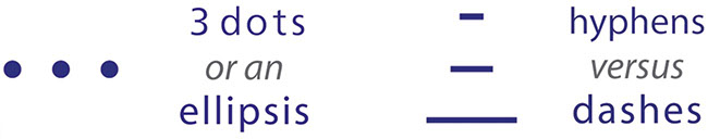
Often, in text on the net and in print and other media, I see multiple full-stops instead of an ellipsis1 , or a hyphen2 instead of an en dash2 or the longer, em dash2.
If it were known how to press the right keys on a keyboard, maybe they’d be less punctuation mistakes.

intro
amalgam
contact
and …
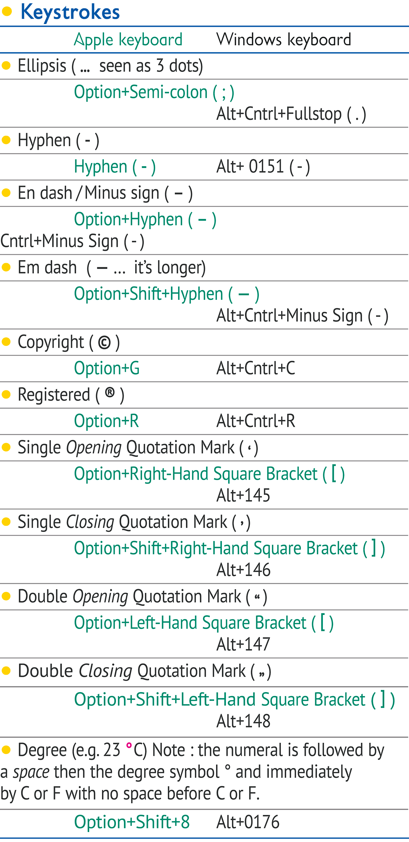
Here is a list of how to press the right keys :
Find out more of the right keys at Microsoft Office online or download Mac Keyboard Special Characters. Both will help your punctuation enormously.
![]()

1 Regarding the ellipsis, it’s shown throughout written history as following directly from the previous word without a space between them. This, sadly, is incorrect as the ellipsis should have a space before it and one after it. Stated on the net and in the Style Manual: For Authors, Editors and Printers 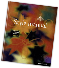 (Sixth Edition, page 110) : “The ellipsis points … are primarily used to show omission of a word or words from quoted material.
“If a paragraph or more is omitted from a block quotation, the ellipsis points can be placed on a line of their own.
“With the exception of quotation marks, question marks and exclamation marks, no punctuation mark precedes the first point of ellipsis or follows the last.”
As noted above, the ellipses is a punctuation mark and can be utilised by pressing Option-Semi-Colon on a Mac keyboard and Alt-Control-Fullstop (Fullpoint) on other keyboards.
![]()

2 The improper use of hyphens and dashes is seen a lot. Often a hyphen is used instead of an em dash [shock, horror!].
In simple terms, this is the correct use of them :
 The hyphen is used in new words with prefixes to establish them from established words e.g. co-author. It is also used when breaking a long word in a paragraph. For example, unifica-tion.
The en dash is a linking device.
These are the main uses
in text :
1 to show spans of figures, time and distance e.g. pages 25–35, 1–7 May, 30–40 km
2 association between words that have separate identities e.g. Asia–Pacific
3 set in mathematical settings e.g. use it as a minus sign with no space between the en dash and the numeral—for example, –21 (do not use a hyphen).
The em dash has three main purposes :
1 to signify an abrupt change e.g. was inadequately cooked—but this is …
2 to introduce an amplification or explanation e.g. some distance away—for example …
3 to set apart parenthetic elements e.g. Jack and Jill—siblings, not lovers—went up the hill.
See the keystrokes in the chart above.
 As before, this info comes from the Style Manual: For Authors, Editors and Printers (Sixth Edition), which can also be seen digitally here on the government website.
![]()
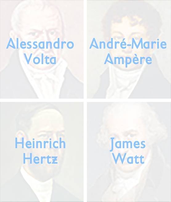
Is it ‘volts’ with a lower case ‘v’ or ‘Volts’ with a Cap?
Often when writing measurements, there’s confusion when to use, for instance, for volts, ailower case ‘v’ or Upper Case or Capital ‘V’.
The rule is :
If the SI Base Unit—“the letters at the end”—is named after aiperson, like Volts from Alessandro Volta, Hertz—Heinrich Hertz, Amps—André-Marie Ampère, Watts—James Watt, etc, then it begins with an Upper Case or Capital letter—e.g. a 100 W globe.
In all other cases it’s written in lower case, like kg = kilogram, mm = millimetre, etc. And when writing it, there should be a space between the numeral and the SI Base Unit e.g. 20ikg. There are a few exceptions, however, which are explained in the Style Manual.