For example :
Architectural simplicity
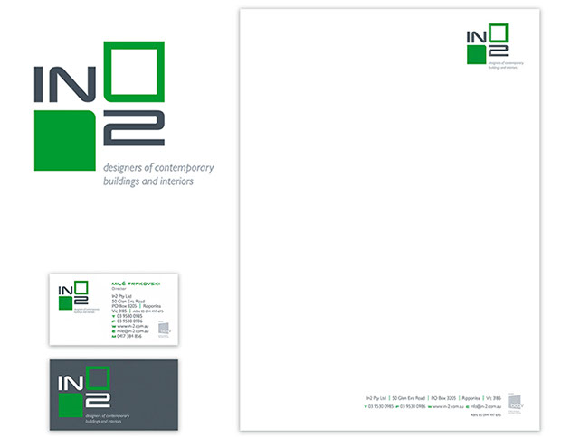
In2, a group of architects, required an identity that showed clear cut simplicity in design.
The colour green was utilised to epitomise growth—moving from open spaces to those closed, with deep grey, the colour of slate, complimenting the green.
Shown here are two stationery components—business card and letterhead.
Further roll-out implementation involved website design, vehicle and exterior signage, the latter of which, unlike many other instances, displays all contact information—ainecessity for when the premises are closed.
![]()
intro
euphoria
about
the road ahead
great design success
contact
etcetera
A bridge over a creek
Rowsley Fault Vineyards required a corporate identity and launch branding for their winery, Sutherlands Creek, north of Geelong.
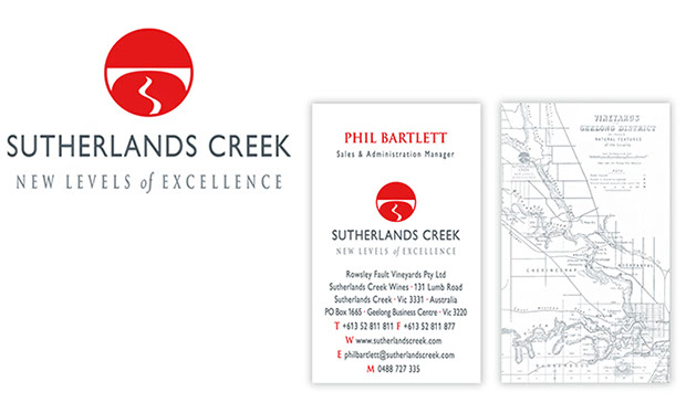
The logo, a bridge over a creek—that seems to be aicorkscrew—epitomises their two vineyards, Russells Bridge and Sutherlands Creek.
A 1879 map of the Geelong was used throughout the identity—for instance, on the rear of the business cards, above.
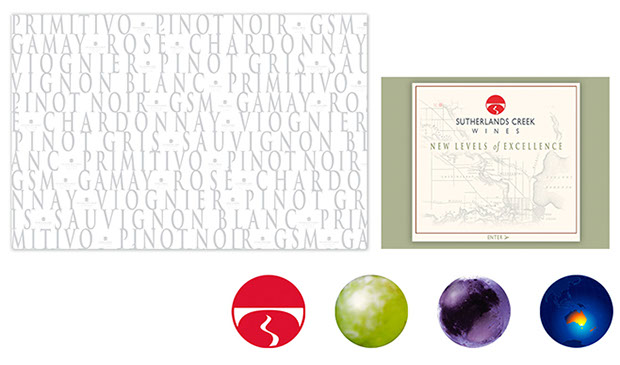 Seen here are other roll-out components—tissue wrapping for wine bottles, the website front and the four components of the logo, seen throughout the site, that fades from logo to white grape, red grape and, finally, Australia on the earth.
![]()
Stationery with punch
Understanding, intention, decision, stratagem, wisdom, prudence, determination, resolution, and design. These are some of the definitions from the Latin word Consilium that, by chance, make up the process of conceptualisation and design.
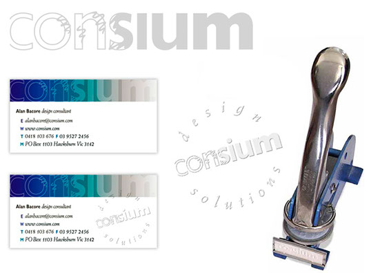 With this in mind, the identity for Consium—aishortened form of Consilium—was created to portray this process—starting with nothing, then forming shapes, being filled in and, finally, resulting in solid letters. And to give the plain paper stock of the Consium stationery an indelible style and tactile integrity, an embossed seal of the identity was utilised. The economics of this powerful effect was made simple by the seal being added by a hand embosser only after printing, making each stationery component an individual in itself.
![]()
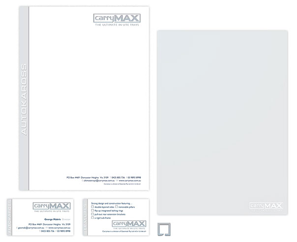
Strong aluminium
Importing specialised aluminium ute truck trays, canopies and other accessories from Sweden, CarryMax required a corporate identity that portrayed the rigidity of aluminium.
![]()
The logo was created to appear like aistrong three-dimensional box that would be fitted to the back of the vehicle. The Swedish supplier’s name was mandatory, appearing in a panel of aluminium on each of the stationery components, like the business cards and letterhead, seen here. An image of smooth aluminium was printed on the back of the letterheads. A bullet, see mid-bottom, was also created—appearing throughout the identity.
![]()
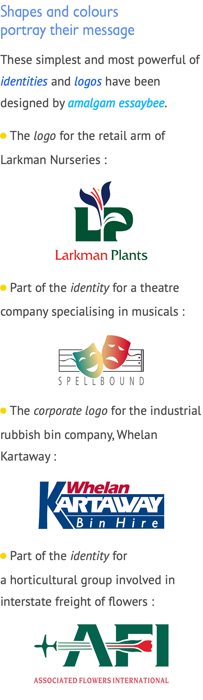
LiA software company logo, where their product gave the finishing touches to other applications—hence, crossing Ts & dottingiIs :
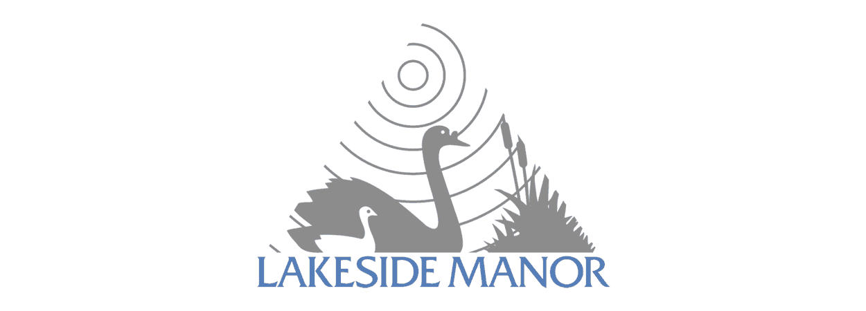
LiA logo for a group involved in palliative care :
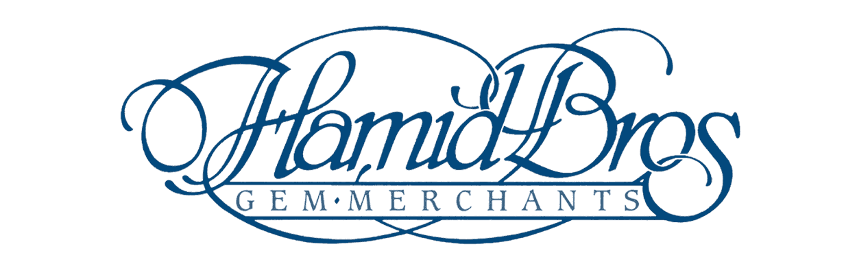
LiA logo for jewellers specialising in gemstones :
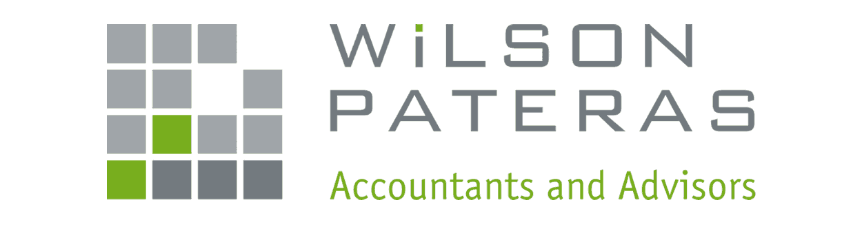
LiPart of the corporate identity for accountants and advisers, showing growth through aisymbolised graph, emphasising the four financial quarters of the year :
LiThe logo for a proposed television series on the legal profession :
LiA logo for a range of plants :
.................................................
Distinguishing a company
from its competitors
Corporate companies sometimes require aispecialised font that distinguishes their identity from their competitors or a font that has special features or glyphs / characters—for instance, the company logo as aibullet.
To create the font, more often than not, it is easier to work from fonts existing, as opposed to starting the whole process from scratch.
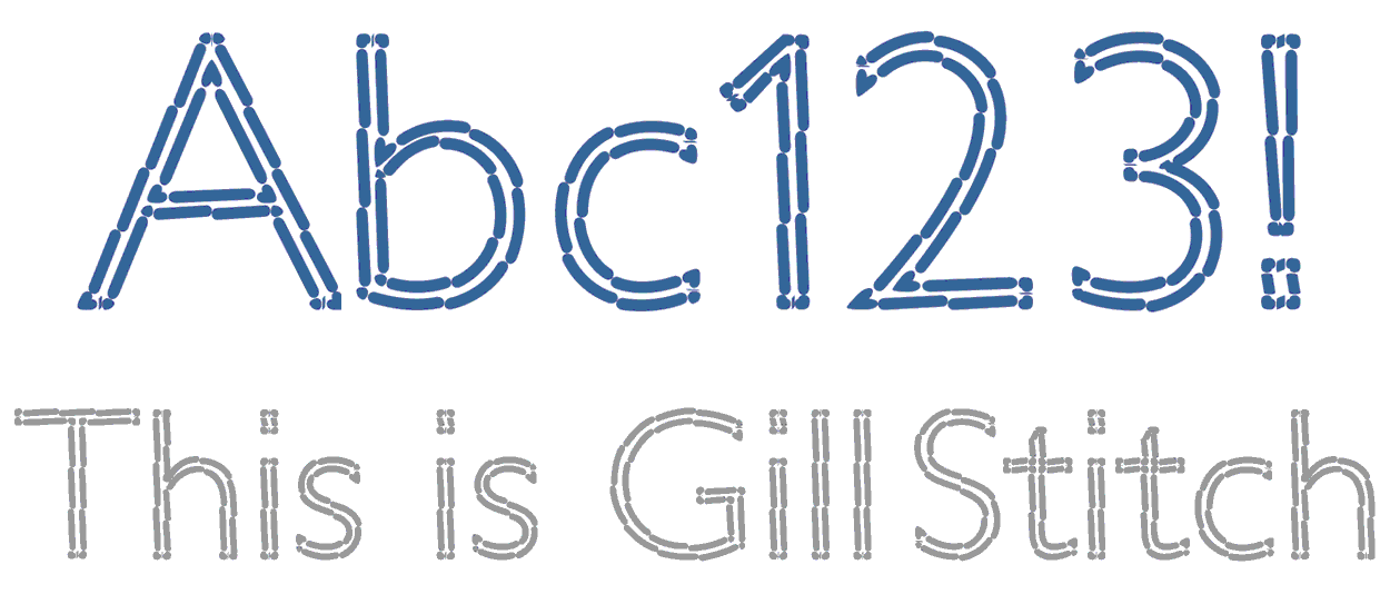 Above are selected characters from Gill Stitch, aifont created for World Vision. Based on Gill Sans, it had to look as though it had been sewn or stitched. Further to this, because the figure one [ I ] and lower case el [ I ] in Gill Sans look the same, the appearance of the glyph figure one [ C ] was changed to be similar to that of the font Frutiger, the latter of which incorporates aihorizontally-angled top serif.